Hassler Sales App
Responsive estimation tool for HVAC contractors
Role
UI/UX Designer: Responsible for user flows, wireframes, visual design, and design system
Timeline
October, 2020 - January, 2021
Tools
Figma, Photoshop
Context
Estimation tool designed and built for an HVAC (Heating, Ventilation, and Air Conditioning) firm to create detailed job estimates on and off site. Project starting point was an existing work-in-progress app developed to meet the specific needs and processes of the client.
Problem
The existing tool ran on desktop only and lacked in user-friendly, intuitive flows as well as visual cohesion and consistency.
Solution
The goals of the project were to adapt the tool for additional breakpoints, introduce best UX/UI practices into the product, expand on some of the existing functionality, and create a consistent UI style.
Landscape tablet screen orientation was decided as the smallest breakpoint, as it provided sufficient screen real estate, necessary for the information heavy screens, as well as portability. Once tablet designs were finalized, I adapted them for laptop and desktop breakpoints.
All “after” screens are shown in tablet format.
Quotes Screen
The user starts their journey with either creating a new quote or viewing an existing one. One of the main challenges was the density of information that was necessary to fit on every screen. In this case, the solution to split these actions into a tabbed layout was obvious. The new design allowed more space to display each functionality, which in turn created room for additional features. Here, I also suggested we use accordion style layout to view details of every quote and take additional actions.
Product Selection Screen
On the next screen, the user selects products to add to a new quote. The first design iteration had poor organization of space with no visual hierarchy of the elements and ambiguous UI patterns, such as main navigation in the upper left is a combination of a menu and a progress bar. As well, the numeric input stepper in the product cells is hard to read and recognize. The new design features a new header with clear navigation and client information that is now consistent on every screen. I also brought visual cohesion to the product selection with better spacing and a standard numeric input UI pattern.
Product Overview Screen
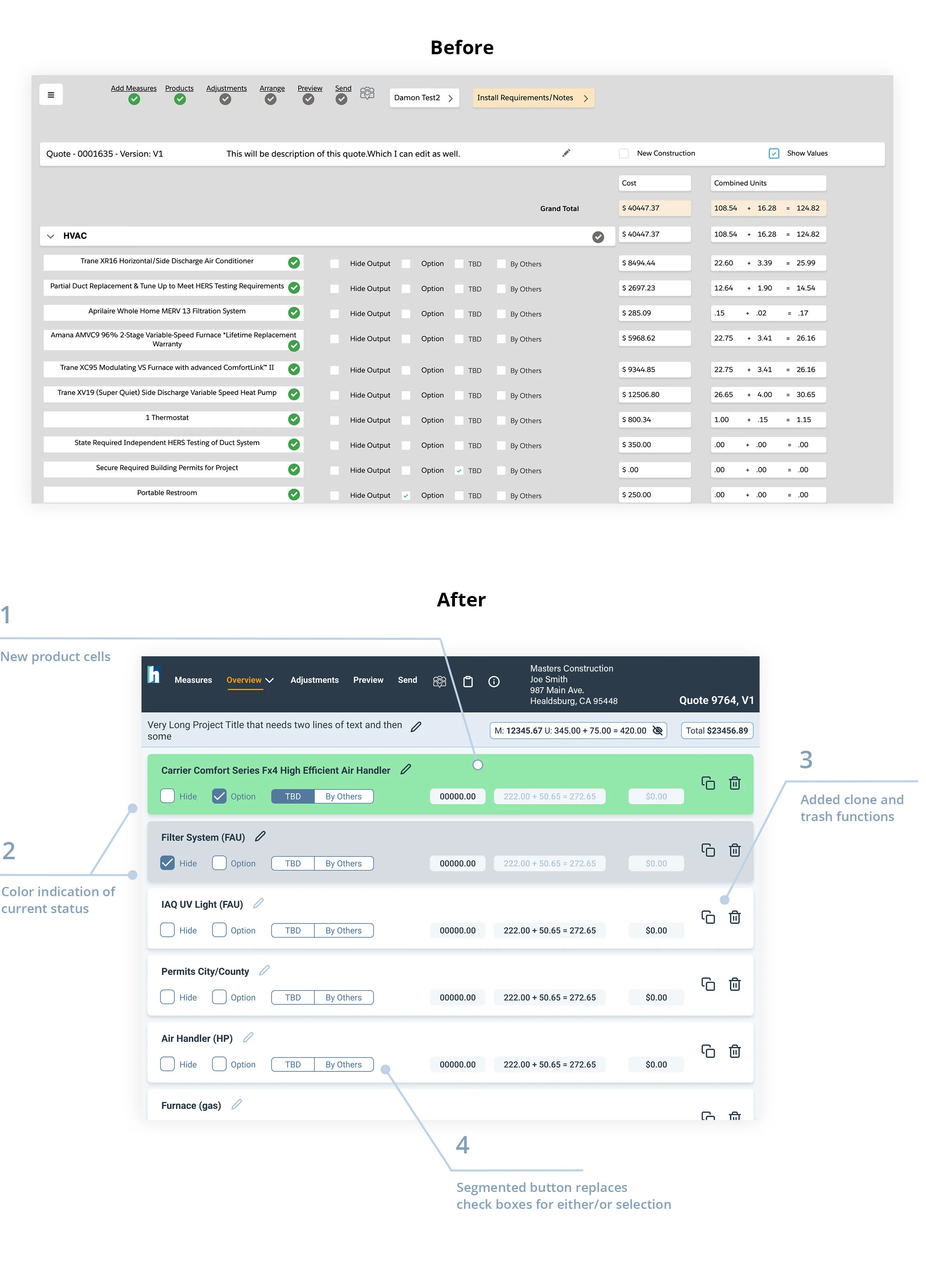
On this screen, the user makes global selections per product that have cost implications. The main objective of the redesign was to bring visual organization and readability while also introducing a couple of new functions (clone and trash buttons shown below). I took an approach of grouping relevant elements into separate cells. Each cell contains all the actions and calculations for that product, and makes the screen readable at a glance. I am reinforcing the choice made by the user with color indication which reflects their selection. The two numeric fields in the upper right show breakdown of the cost and grand total. The new “hide/reveal” icon allows a contractor to view and hide cost calculations that pertain to travel and man labor that is not always necessary to show to a client during quote creation. These fields update in real time as the user makes product specific selections.
Options Selection Screen
Next step is to select specific options for every product. On this screen, I created continuity from the previous screen by keeping the title bar, which contains calculations. Again, I was faced with the challenge of accommodating significantly more information than had previously existed, which I solved by introducing expandable tabs on the right side. Additionally, I introduced tablet specific UI and fixed placement for Save and Exit buttons, as opposed to floating buttons from previous design that changed their location depending on the volume of the main content.
Responsive Design
Once we had the design of the tablet screens ironed out, I adapted the layout for larger break points. This was a custom job per screen as it largely depended on the density of information. This part of the process required some discussions with the engineer, where we established some ground rules for how elements would move and also decided on restrictions to keep things consistent.
Design System
We arrived at the final UI scheme after exploring multiple options. I had begun implementing a design system as soon as the choice was finalized. The design system evolved with new screen iterations. Final phase involved organizing it into sections and adding notes, so the development team could easily draw connections between the elements and the context they are used in.
Outcome
This was a project with quite a few challenges: from finding ways to display large volume of information per screen to translating the designs of various density into code, to educating the client on the importance of testing. In the end, we had accomplished the original objective of adapting the design for the tablet screen, introducing good UX and UI practices, and creating an attractive and consistent interface.
An important lesson learned on this project is to involve engineering earlier in the process to iron out the responsive aspect. Next time, I would get their input before the tablet screens were finalized to work out some consistent rules for implementation with the evolving design.


